Web design is not restricted to any barrier. As web designers, we
used to fickle a lot and love to experiments with things to come up with
a creative and new concept that can charm and captivate the visitors.
Everyday, creative web designers exploring new possibilities and apply
variations with existing or new trends to make their work more
remarkable. The year 2010 proved as an incredibly verdant for web
designer community. We are now well into year 2011 and it’s time to pack
away the old design trends of 2010.
With hungry eye, let’s move in the future and see a new face of tomorrow. Over past few months, we have analyzed numerous web designs over web and come across lot of changes in the web design industry. We have noticed a definite shift according to which web designers these days are more focused on function rather than the beauty with no substance in the year 2011. However, predicting the evolution of web design industry is very tough.
In this post, we are going to discuss all those changes, upcoming trends, new design elements and new design approaches we identified, discovered and observed over the last months. Here are Current Web design Trends for 20011-2012. These new trends are more focused towards visual approaches and new design elements. We hope that these new web design trends and techniques taken into account by you for your next project.
Below are some of the websites powered by HTML5 and CSS3. Take a look:
SOURCE
SOURCE

SOURCE
SOURCE

SOURCE

SOURCE
SOURCE
Twitter
SOURCE

SOURCE

SOURCE

SOURCE
With hungry eye, let’s move in the future and see a new face of tomorrow. Over past few months, we have analyzed numerous web designs over web and come across lot of changes in the web design industry. We have noticed a definite shift according to which web designers these days are more focused on function rather than the beauty with no substance in the year 2011. However, predicting the evolution of web design industry is very tough.
In this post, we are going to discuss all those changes, upcoming trends, new design elements and new design approaches we identified, discovered and observed over the last months. Here are Current Web design Trends for 20011-2012. These new trends are more focused towards visual approaches and new design elements. We hope that these new web design trends and techniques taken into account by you for your next project.
1. CSS3 + HTML5
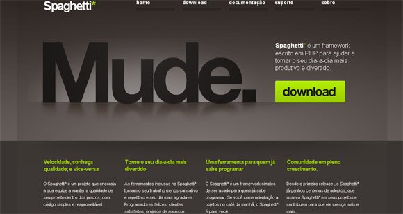
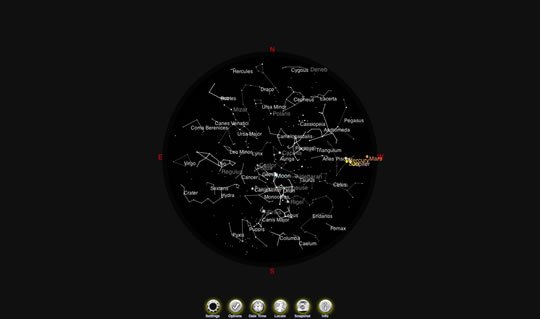
One of the most unexpected trends we’ve observed over the last months was the more use of CSS3 and HTML5 on the horizon of web designs. Most of web designers are jumping from Flash to HTML5. Earlier, designers are misusing Flash when it comes to web design but now it’s not going to work anymore. Please notice that Adobe Flash and HTML5 are two different things. HTML5 introduced to share the burden placed on Flash but HTML5 cannot substitute Flash when it comes to create the extraordinary design elements.Below are some of the websites powered by HTML5 and CSS3. Take a look:
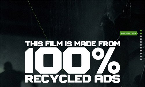
Nike Better World website
Spaghetti* Framework

SOURCE
Eyestylesllc

SOURCE
NakshArt

SOURCE
2. Go For Simple Color Schemes
Simplicity is the key. Forget about color and shades like black, white and grey but try something simple and truly remarkable. Experiment with primary colors like green, yellow or red intelligently to create a web design but limit palette to two or three colors. Web designers can play with shades of each color to create really inspiring color combination to communicate a message. Here are some of the best examples of great web design inspired with color schemes formed by using different shades of primary colors like green and red.Toriseye

SOURCE
Collisionlabs

SOURCE
3. Mobile Device Compatibility
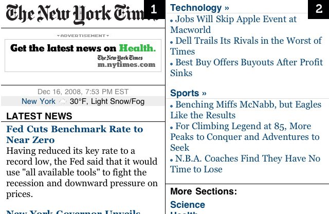
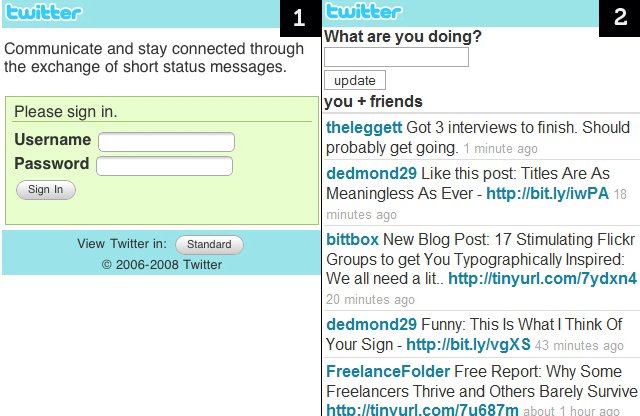
These days, mobile web browsing has gained popularity among people as the next major Internet platform. This brings necessity of mobile optimized websites highly compatible with all mobile devices. As per the latest trend of mobile-optimized interfaces, web developers are more focused to create websites which are highly responsive to multiple viewports. Here are few examples:New York Times

SOURCE

SOURCE
Digg

SOURCE
4. Parallax scrolling
At present, web designers are more focused to create a sense of depth in website design and this is the most effective web design trend for 2011. This emerging trend brings parallax scrolling into the picture. Parallax scrolling is a special technique first used in side scrolling video games but now in website. In the parallax effect, designers are using multiple layers to create an illusion of a 3 dimensional space where background images move slower than foreground image to add nice three dimensional depth illusions to the design. It can be done with the help of simple CSS tricks or Spritely jQuery plugins.Rowtothepole

SOURCE
Rastapé

SOURCE
No comments:
Post a Comment